Photoshop Experimentation.

As a way of experimenting with my idea I decided to do what I initially decided I wouldn't do and use Photoshop to edit existing images with my theme.
Using landscape images found of New Zealand on a Flickr profile I'm fond of - Cuba Gallery, I experimented with the idea of placing the 'cube' in different positions, due to them being photographs and not reality, I was able to put the cube in positions that defied the laws of physics, although I found that the images that did this were not very successful.
As previously stated this was intended only as a means of getting some images together and seeing how they would work which is, as the first two show, not very well.
But why don't they work well?
What are their Flaws?
Can it be easily rectified? If so How?


 I found this to be the most successful image, and believe this to be down to the placing of the square and the fact that it is in a position that could be achieved in real life
The composition of the original image allowed me to place the 'prop'  in a place where the viewer could be drawn into it, conforming to the rule of thirds it is only natural that the eye is drawn to the centre of the piece. This image looks a lot more intended rather than just random placing like the previous images, but this does not detract from my original intention, so considered placement looks like it will come into play when playing about in real life with my future experimental images.
hamish fulton
richard long
donald judd
robert smithson

arte povera

Tutorial with David Appleyard.


Anish Kapoor

Coming from more of a design background and with experience himself in creating commissioned sculptures, David was the man to talk to in terms of helping me with the research and development of my idea, grasping my concept and suggesting further artist's of interest that will help develop the context of my work further.


Winter/Hörbelt

How will the weather/season/light conditions change the environment?
We discussed how, with the Autumnal weather beginning to take a grip and by the end of this brief (17th January)  the winter weather will be fast approaching, the elements could be used to my advantage to modify existing landscapes and how effective my objects would be at 'showing off' their  respective  landscapes in weather conditions such as snow and rain.

Material wise, as I am currently at experimental stage and also I would like the device to be portable to take it to various locations, I will create an initial maquette out of cardboard and see how effective it is, my intention is within the next week or so, to take this 'prop' to Ilkley Moor' a place with both green and heathered landscapes and also home to a quarry like excavated area, in order to carry out test images and point me in the direction of what to do next, with an open studio scheduled for Light Night (October 8th) I feel it essential I have some test images ready in time to show at the event.

This led me to thinking of the position of the object within the image.

Moving into the Studio and the Artist's Coffee Morning.

Before today's 'show & tell' exercise we had a short seminar with Dan in order to generate more discussion on the possible avenues the brief could be taken down.
Whilst each of us will have already thought of  our own artists and movements that relate to our train of thought, Dan presented to us a few of the names he felt would be of interest to many of us in terms of the way the brief could be approached.


key artists from dan

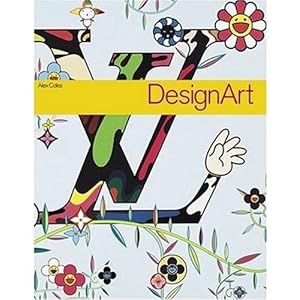
Interdisciplinary writer Alex Coles - 'Design Art' Book


Liam Gillick


e.g Damien Hirst

Furthering on Gillick's use of incorporating implements used to exhibit within the work itself, Dan talked about the way this has become a part of many popular works without us neccesarily realising.
A good example Dan gave us of this was the infamous

'The Physical Impossibility of Death in the Mind of Someone Living' or Shark in a glass tank of formaldehyde (as it's often known) by Damien Hirst, Dan's argument was that the case and formelahyde may not be part of the exhibit but merely just tools used to exhibit the shark.

Another interesting point surrounding this work is the fact that the original shark, due to initial poor preservation, was discarded and replaced by another a year or so after being sold.

The notion that the work can be called the same one that caused such controversy, and therefore the justify it's value somewhat, has become itself a philosophical question.
Hirst himself acknowledges:
It's a big dilemma. Artists and conservators have different opinions about what's important: the original artwork or the original intention. I come from a conceptual art background, so I think it should be the intention. It's the same piece. But the jury will be out for a long time to come

This leads to notion - can we even trust what is being exhibited to be genuine?


Do we even have to see an exhibit or can the idea itself be enough?
yves kleine -

Anthropométries

throwing gold away into river. 

Buyer only owns the reciept.


Jeremy Deller


 - reminded me of Dash Snow


his work often places the view in unsettling postions and his near to the knuckle approach is often ruthless in it's execution.


rebelling against his privileged upbringing by exposing the weaknesses of his urban surroundings and showcasing them in a shocking, no holds barred manner.
"met a junkie’s end but did so in a $325-a-night hotel room with an antique marble hearth."
Whilst not archiving others work in his own like Deller,Snow was a prlific colaborater and as such never truly belonged to one media, collaborating with many practicioners of various backgrounds throughout his short but explosive career.


was more of a rock star than an artistliving his outrageous lifestyle tot he full until finally succumbing to it last year at the iconic age of 27.
Dash Snow at the Saatchi Gallery 

Mark Dion


Pavillion - aurelien Fromont

Dan also tuched upon the idea of intergrating with other organisations as a way of expanding the brief using Victoria Kershaws recent work - kids spoons, as an example.

I myself will be starting work experience at a rural primary school near to my hometown in the next few weeks, with my first session being in charge of up to 8 pupils and with the responsibility of setting a task for them to work on, be this musical or to do with the arts, so i am now thinking of trying to incorporate a theme of my current work into their task to see how young minds envisage it.
Dan was trying to get us to envisage the way objects could be the exhibit, as well as the exhibit being the object.


Argument of the differences /similarities between the 3d/interdisciplinary courses


Show & Tell - Storm Thorgerson.

Tomorrow's activity is entitled the 'Seminar / Exhibition' of objects, and whilst not entirely sure of what my object should be due to my absence, I have plumped for a book containing a retrospective of one of my favourite designers Storm Thorgerson, whose work has constantly sprung to mind each time I envisage the route I want to go down for the 'Exhibit / Show' brief.


I have been a huge fan of Storms work since i was 12 years old when I purchased Audioslave's debut album which featured his artwork.
An aspect of Storms work I find sets him apart from most artists is that his workload is almost entirely commissioned, with artists and bands being the creative people they are they often find it hard to let go of something so precious to them so they often collaborate with Storm by giving him themes or stories of what the album cover should tell.

From the days of epic gatefold sleve's where his vast artwork would sprawl across the large cardboard canvas, through the smaller jewelled surrounding of a CD case and now into the almost microscopic world of MP3, Thorgerson has managed to keep his work fresh through what he calls his 'straightforward' approach of just creating what the artist or the music requires.
 Below is the first image of Storms i ever knowingly saw, I have since discovered many covers I have admired are in fact Storm's and I am often astonished by his prolific continuity and high standard, whilst also his experimental freshness and the feeling that your never quite sure what's to come next.

His go to man in terms of photography is the renowned Peter Curzon, who combined with the artistic vision of Thorgerson has captures some of the most captivating images to grace


His choice of medium is also an interesting topic:
"I like photography because it is a reality medium, unlike drawing which is unreal. I like to mess with reality...to bend reality. 
Some of my works beg the question of is it real or not? 

It is quite astonishing to learn when looking at Storm's vast back catalogue that their is 9/10 minimum/no photoshop used to create the image, and even when it is it is not used to alter the image too drastically. He is so dedicated to his art that each image can take months to create due to his perfectionistic manner requiring the specific lighting or weather conditions, resulting in his teams astounding images.


An obvious influence on Thorgersons work is Surrealism, either down to the works he is designing for, e.g Pink Floyds surreal 'Prog' Rock required an equally 'out there' cover to complement it's soundscape, or down to his artistic taste. Comparisons to Dali, in particularly his painting "The Pesistance of Memory' can be seen in many of his covers.

Thorgerson has unique grasp of the elements he wants to portray within his work and knows exactly which to execute to create the right mood, often encorporating fire to counteract his continued use of water.

So revered is Thorgersons work, that he often collaborates with artists across a series of albums, most recently he has become synonamous with the output of both Biffy Clyro and The Mars Volta, his most notable work of course though can be seen on the majority of Pink Floyds releases since his first cover for them - Dark Side of the Moon, when he was part of the Hipgnosis desgign studio.


his thematic use of the elements


Thorgerson has an ability to perfectly execute his covers s that everything within the shot is set up just the way it should b, without a single element out of place or left to chance, giving the impression that he must be a hard taskmaster to work with, but a true auteur at the same time.

It is Storm's grasp of the environment and the ethos that everything in the image was intended that I feel will work strongly in my work, but it will require me to adopt his strict uncompromising manner if I even dream of creating works of his standard.