8 Days a Week.

I've been a busy boy this week, hence no posts until now.

Originally signed up for the curation team my original suspicions that I would have to muck in a lot more for the set up to run smoothly came true so on Monday myself and the other people on the same train of thought as myself set up with the preparation.

The core team for setting up has been myself, Jaclyne, Becky and my partner in shelf building crime Andrew.

Splitting up into two groups, the girls for curation and consultation and myself and Andrew for construction and installation proved, whilst not ideal, to be a good match.

So Monday was spent selecting the work and generally tidying away the studio spaces whilst we waited for the timber for the shelves to be delivered.
Layout plan's were drawn up and with the help of others the works were categorized into appropriate sections and photographed for record.

On Tuesday Andrew and I with the help of the ever helpful Roger Berry in woodwork, set about cutting the materials for the shelves which are as follows:
Wooden Posts with a groove cut in using a special router, which the work would sit into.
Baton's made up of the same material to affix said post to the wall and last but by no means least a choice of two surfaces of which the work would lay upon - Bright Orange perspex and a more sedate wooden ply which with the help of a few first years wood be transformed by a lick of linseed oil to bring out the grain.

On Wednesday things really kicked into gear with the most help we had had all week thanks to the 1st and 2nd years, we made the most of this and got the majority of the general manual work out of the way - painting, more shelving, cleaning and tidying.

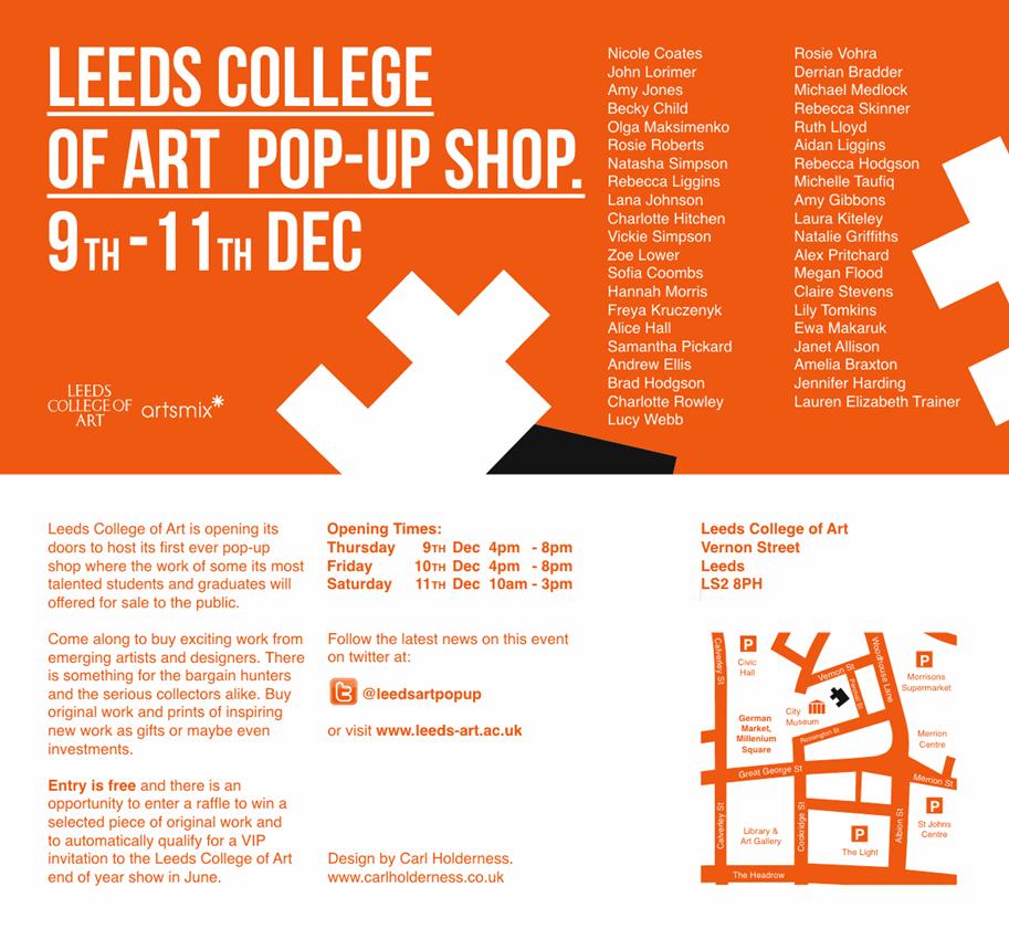
My only time off this week being Wednesday afternoon and all day Thursday, and even that wasn't for a rest as weeks spent planning the colleges first 'Pop-Up Shop' with Bridget March and Gina Yates of Artsmix* finally went into action and left myself in charge of deciding the look of the shop and it's layout and overseeing the vendors down at the foyer of Vernon Street and solving their problems throughout the day.

http://www.leeds-art.ac.uk/home/news-events/news/article/leeds-college-of-art-pop-up-shop/


Whilst on the face of it two very different enterprises, the similarities of set up and in particular my job's in both ventures became quite apparent.

Having to give a lot more time than I expected to both projects has left me immensely tired but satisfied that a good job has been done


My work was even selected for the raffle prize, so even if none of the work sells which I feel may happen but I'm nonetheless happy to be a part of this experience anyway, has guaranteed me some pocket money.


In my free time setting up the Pop-Up I kept popping back up to Blenheim to check out on progress and muck in when I could
my work is finally up

By this time the A4 show was coming together we needed people to know when it would be on, so Jaclyne roped in our good friend and Graphic Designer Liam Hine to help her create the posters which later in the week would be screen printed by Liam and Jaclyne and distributed both around the college and outside.
Below is the designs for the poster which I am really pleased with and feel Liam did a great job with, especially considering the limited time he had to create them.

So for all your Graphic Design needs do check out his website:

At this point, with all the shelving nearly up I was able to put up my own work which with all the screws in place and the back plate made was ready to be drilled into place.


As with Basil Fawlty and 'the war' the rest of the team insisted on winding me up with the oft repeated question "are you putting a light in it".
This was an idea that as previously mentioned did come up in the design of the piece but I felt at that point I'd much prefer it if there wasn't a light as it would detract from the image.
This again reared it's head when the piece was made and after consultation with Roger Berry the idea of installing a halogen light (the only viable method due to the high strength needed) was ruled out due to the heat this would kick out and the risk it would put on the acetate imagery.
When actually installed I have to admit that contrary to everyone else I liked it the way it was as I felt that due to not being lit up the first few images were blurry and this created and element of intrigue that was answered upon closer inspection of the darker images to the rear of the piece.
The light question was again asked when a spare strip light cam available but on testing the strength was no way near as bright as it would of had been and this it finally appeared concluded the argument and my piece was left alone to my great pleasure.
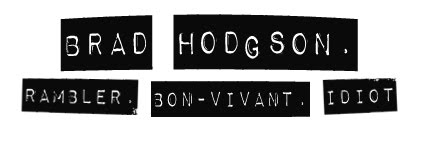
The main lesson I learnt early on is that problems will arise regardless how organised you think you are and the best way t deal with them is by just remaining active no matter what job is needed wether it be shelving, curating or as I found out half an hour before the preview opening - name label making.

Saturday was spent painting the studio floors, which actually took less time than expected and as we found on Monday morning was worth the extra effort as they looked great and really smartened up the show.

By this point I was ready for an epic lazy Sunday...

Brion Nuda Rosch.


Playing about with both the addition of 'blank-space' and foreign landscapes through the medium of collage.


A4 Show Preparation.

On Friday 10th December the course is holding a preview of the new winter exhibition, but this year it will have a twist.
Rather than last years 'Art and Stuff' event which was used as a showcase of current briefs, the new show asks artists to respond to the brief of 'A4'.
Whilst encouraged to keep the submitted work of some relevance to current briefs, the submitted work must conform to the dimensions of A4. Wether this be one piece or several, paper or other material once the strictness of the format is explored there appears to be a lot more than first glance. 


I originally thought of making a film piece of my 'Presence through Absence' work, and projecting it A4 size, but thought of this as being too obvious and boring and thought I should challenge myself more.


After an initial meeting with Cheryl confirmed that it is not essentially about creating something A4 sized, rather exploring the concept and the way in which it could be interpretted I went back to the drawing board and came up with something i feel will be visually interesting.


After my research on Wolfgang Tilmans, (his succesfull work that is not his Liverpool bienniel 'muddle'), and my urge to display images in a new style, I have taken the opportunity of using the A4 show to do so.


My idea is to create 12 identical individual A4 frames each housing the same image printed on acetate with the contrast of each image differing, so that when placed in front of one another on the wall they will allow the viewer to look through what should be a changing image.
I have decided to use this image taken from my Ilkley Moor work as I find it to be a really interesting image with a great tonal range that I hope will work well with the piece I plan to create.
The piece itself is inspired by one of my favourite works, Gerhard Richter's 11 Scheiben (11 Panes), which I unsuccessfully tried to incorporate into a previous project and now feel a variation of it would make a really interesting piece and conform to the A4 stimulus.
As the Richter piece is made out of panes of glass in order to create an image rather than house it, it remains to be seen what effect my interpretation using acetate will have, another interesting example of layered imagery is this by Chinese artist Xia Xiao Wan, for whom the glass are a canvas on which to paint onto.

Using a CNC wood router to cut out frames at the specified dimensions I am then going to use threaded rod to affix the frames infront of one other in order to keep them at an equal distance and consistency they will be screwed in place along the structure and attached to a backplate which will then be drilled into the exhibiting wall.


I estimate next week to be a very busy week indeed, and whilst I am only signed up for curation I am happy to help out in other area's to ensure the set up is done in time.

What Is A Drawing?

Last nights episode of the Culture Show on BBC2 was of particular interest to me, not only did it feature MIMA my hometown art gallery but also Lawrence Weiner, an artist I hadn't come accross before but who's work i found captivating in terms of it's definition.
In my presentation on Monday i talked about not labelling myself as a photographer which seemed to polarise my presentation as I was of course showing photographs.
Weiner is  but he feels that his work is drawing with lines rather than sculpture or design.
'A LINE IS A LINE FOR ALL THAT' is a major new commission using vinyl which is then emblazoned onto the 500m2 glass facade of the mima building by acclaimed New York artist Lawrence Weiner.
It is part of the Drawing in Progress exhibition at mima (Middlesbrough Institute of Modern Art) which is my nearest large gallery back home. The exhibition shows a unique collection of some 40 post-war American drawings collected through the Art Fund International scheme that now form a significant strand of mima’s collection – and is on show until March 2011.
I found the programme really interesting in terms of questioning the very perception of what a piece of work can be and feel this line of questioning is something relevant for my current brief which has seen myself questioning just what it is I am creating and why on a daily basis, but I also feel this to be a positive thing as I am having to think constantly about the perception of my work, which an only  make my work more considered and stronger.

Homer Sykes.

This Afternoon I managed to get along to a talk being given in the lecture theatre by renowned photographer and archivist, Homer Sykes.
I wasn't too familiar with Sykes' work previous to the talk having only been familiar with his imagery from a few telegraph articles, but was really glad I took the time to go.

Talking about his life and how he 'fell into' photography and how the world has changed so much in the time he has been photographing it was really charming and his salt of the earth attitude was really nice to see.
Over running by over half an hour, everyone just kept encouraging Homer to keep going like a Grandad regaling fascinating stories to his thankful audience.
I particularly enjoyed the shots that make up the main body of homer's work, his fascination with British tradition, from gurning in Egremont to Cheese rolling in Gloucester, but it was quite sad to see the obvious decline in the existence of these activities but that was part of Homer's charm, preserving this heritage for future generations.

And On An Unrelated Note...

Tonight I watched the film Dead Man by Jim Jarmusch, and annoyingly i can't screen grab the shots from it I liked or find them on google for that matter, but I found the filming technique really inspiring, especially the monochrome shot's of desolate locations, someone on my own wavelength.


A Winters Tale.

Finally, after yesterdays informative presentation, the underlying message of creating new work hit home.
So as with my original works I just went out and created it, this time however there would be a marked difference in that my landscape rather than the 'void' is white, meaning that for it to stand out my object would need to be dark.
Covering the original board in black card for it to stand out against the snow landscape I went to Hyde Park in Leeds which has taken a fair amount of the white stuff and would also provide me with a different style of environment to capture my work.
Whilst it may seem a little naive to just 'go out there', I felt this needed to be done in order to freshen things up, and although the works are of questionable quality I still feel they posses something. Unlike the disastorous Photoshop incarnations before them, this series does I feel add something interesting and new to the concept, although wether it complies to the original intentions of the work remains to be seen.
Rather than being a 'void' the black becoems an obvious bold statement that provokes reaction, as was the white piece but I feel the black is too intimadating and bold rather than the mysteriousness of the white.
Altering the images due to the original scale was again something that I felt needed to be done in order for the piece to create the right visual impact.

Positioning My Practice.

put up notes from cheryl, joanna and dan here

LCAD Pop Up Shop.

After attending Bridget March's 'First Tuesday event, designed to get creatives working together and also get their work 'out there', myself and coursemate Andrew Ellis decided to team up and apply to be vendors at the event taking place next month.
Andrew and I are both avid users of Flickr the online photo host, and through this we both became aware of each of others interests in photography and helped each other in selecting appropriate images to sell as well as teaming up on the purchasing and assembelling of frames and mountboard.
We have our first initial meeting with the rest of the vendors this evening and will bring a selection of our prints along.
I feel our work offers great variety with Andrew's work  documenting his visit to the Amazon earlier this year and mine predominantly focussing on local landscapes.


Web Presence.

In prepertation for next Monday's web presence presentations I am preparing my online portfolios using a selection of platforms I have chosen for their relevance and usability.
Disregarding Indexhibit for the moment as problems with set up and usability have made me look on this platfrom unfavourably, I also don't feel it gives a particularly good looking final outcome, I will try to create something on tis by the end of the deadline but for now I want to focus on platfroms I know work and that have great results in terms of proffesional application.

To give my presence a bit of variety I have employed several resources for respective reasons:
Cargo as an introductory page giving a flavour of my work and a brief overview of my practice as well as links to my other outlets.
Carbonmade, an increasingly popular site amongst creatives, as a web based portfolio similar to issuu but without needing a file to be hosted anywhere.
My trusty Blog of which is the most regularly used and updated resource for finding out about my practice.

As well as site based resources we are required for this module to create two PDF files, one interactive and one print based.


http://cargocollective.com/bradhodgson


I am becoming increasingly sceptical about using Indexhibit, it's cumbersome nature and it's proneness to problems has made me reconsider using it, add to this what I feel are pretty average looking results
and
As all I need is a basic user interface that can both showcase work and redirect to my blog I have decided to look at two other recommended options Cargo and Carbonmade.

Applying for a Cargo account is apparently a lengthy process, I have already submitted my application and hope to have an account set up relatively soon.
Carbonmade on the other is immediate in it's application and as shown below has made the flickr slideshow redundant with it's slick and easy to navigate portfolio viewer.


a platform that is becoming increasingly popular amongst practitioners and employers as a way of finding emerging creative talent.
provides users with a nice crisp interface,
in a similar vein to Indexhibit it's layout is very set in it's ways, but whilst I feel I can work with Carbonmade's conformations easier than than i can with Indexhibit's strict left sidebar alignment, which feels redundant in terms of how I would make use of it within my site.


Working in a similar fashion to how 'Issuu' navigates through a PDF document


Whilst I await to see if I can get a Cargo account sorted in time I need to crack on with both creating more work and PDF's in which to show them.
So as for my web presence portfolio I now have a Blog, Carbonmade Site and now need to create two PDF documents, one web based and one interactive, which all need to have a cohesive and consistent feel about them.


Artist's Coffee Morning Take III

Steve talked to Andrew and myself today during the artists coffee morning, ( different running order this time, this week's session was aimed at Interdisciplinary presenting their work informally and next week 3d will return the favour with their formal presentations, about photographers Lee Friedlander and Diane-Arbus in relation to Andrew's work.

Tutorial With David Appleyard.

I scheduled a tutorial with David to talk about where I plan to take my work, and he being a construction in relation to my planned visit to Dale Head, Cumbria a week on Friday.